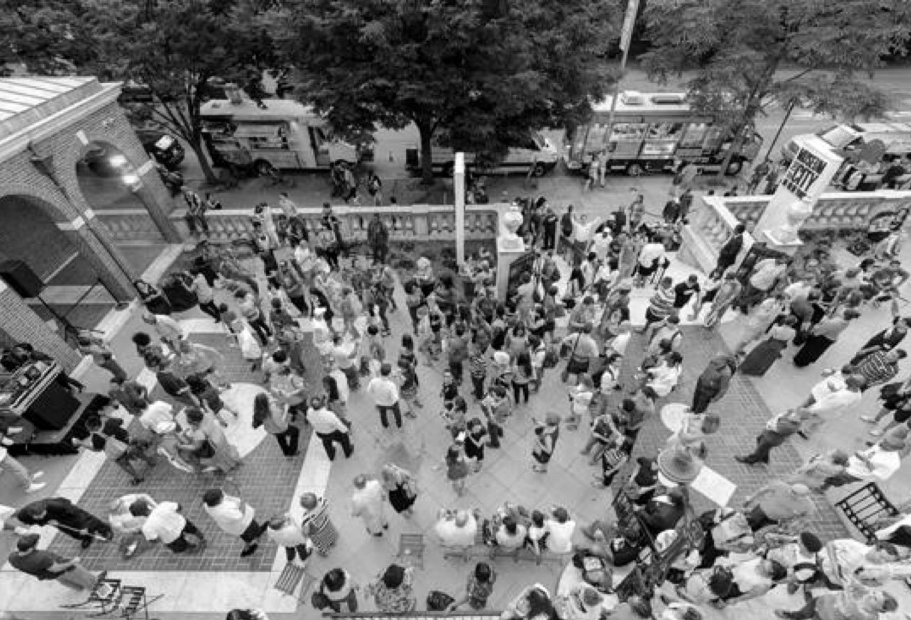
Future City Lab: Population Density
Interdisciplinary

Time Estimate: 45 minutes
Connection to Future City Lab: Housing a Growing Population: How can we meet the housing needs of New Yorkers?
Connection to Port City: Confronting Density, 1810-1865
Connection to World City: Out and Up, 1914-1929
Objectives:
Students will:
-
be able to describe what population density represents
-
be able to analyze infographics and evaluate them for accuracy, content, and effectiveness
-
be able to create simple population density infographics
Materials:
-
Basic 4-function calculator
-
Population density worksheet (note: teacher key in file – print first two pages only for student use)
Standards:
-
6.SP.B.5: Summarize numerical data sets in relation to their context.
-
7.SP.A.1: Understand that statistics can be used to gain information about a population by examining a sample of the population; generalizations about a population from a sample are valid only if the sample is representative of that population. Understand that random sampling tends to produce representative samples and support valid inferences.
-
6RP.A.1: Understand the concept of a ratio and use ratio language to describe a ratio relationship between two quantities.
-
7RP.2: Recognize and represent proportional relationships between two quantities. b) Identify the constant of proportionality (unit rate) in tables, graphs, equations, diagrams, and verbal descriptions of proportional relationships.
-
RHST.6–8.5: Integrate quantitative or technical information expressed in words in a text with a version of that information expressed visually (e.g., in a flowchart, diagram, model, graph, or table).
-
WHST.6–8.9: Draw evidence from informational texts to support analysis, reflection, and research.
Guiding Questions:
-
How do we illustrate information to help us understand trends and underlying meaning of data?
-
How can we use population density to understand our city?
- Introduction: What is population density and why is understanding it important?
- Group discussion: What does population density look like on a map?
- Population Density Activity
- Next Steps: An Increase in Complexity
- Extension Activities
Procedures
Students should be familiar with both words separately, and should be able to combine them into a coherent definition of the phrase. (Note: not all 6th graders are familiar with the term “density” and this might require some pre-teaching.) Answers for the second half of the question should most likely include allocation of resources; however, in a social studies class some discussion might revolve about representation in government.
If able, start the discussion using the Slate.com interactive tool that sees how much territory in the U.S. would be needed to equal the population of New York City (make sure that “New York City” is selected at bottom of the map, then click on a region of the country and it will automatically fill in the territory needed to equal population). This should facilitate a conversation on density.
Explain that questions of uneven distribution of population have, in the U.S. context, contributed to questions about fair allocation of money and resources. Introduce Neil Freeman’s “Election Reform” map, which was designed to imagine a United States with 50 states of totally equal population.
Return to Slate.com for a series of visualizations inspired by Freeman’s map, all demonstrating the various ways population could be divided up in creative ways using the familiar geography of the continental United States.
Students should engage with questions like:
1.) How do these maps change your understanding of population within the U.S.? Does your response change if I use the word “population density” instead?
2.) Which of these maps actually improve our understanding, rather than just looking pretty or interesting?
Pass out worksheets to help them understand and create this type of infographic.
Prompt: Sometimes we need more information about population and population density. We can use simple models to help us illustrate population density.
Prompt: Refer to the worksheet and the two sets of population density infographics. Why do we include the second set of infographics when we already have New York City-wide information in the first set? Being more specific gives us more information that can be useful. Can you think of any other ways that we can be more specific?
Take a look at the NYC subway map, available here.
Can students guess where the most densely populated sections of the city are? See this visualization for confirmation:
https://www.arcgis.com/home/webmap/viewer.html?webmap=80f9b95a4ce0491091f1477710f6a91d
Speculate: which parts do you think are denser on their own, and which became denser because of the presence of subway line service? (Subway established in 1904, when much of the outer boroughs were farmland.)
On the Slate.com interactive density tool, select “coasts” and then click in the center of the country to facilitate a discussion of the historical reasons why our coasts are so densely populated.
Additional Resources
Fieldtrips: This content is inspired by the Port City, 1609-1898; World City, 1898-2012; and Future City Lab galleries in the Museum’s flagship exhibition, New York at Its Core. If possible, consider bringing your students on a fieldtrip! Visit http://mcny.org/education/field-trips to find out more.
Acknowledgements
This series of lesson plans for New York at Its Core was developed in conjunction with a focus group of New York City public school teachers: Joy Canning, Max Chomet, Vassili Frantzis, Jessica Lam, Patty Ng, and Patricia Schultz.
This project was made possible in part by the Institute of Museum and Library Services.
The views, findings, conclusions or recommendations expressed in these lessons do not necessarily represent those of the Institute of Museum and Library Services.

