The Census and Who We Are
Friday, March 27, 2020 by
New York City is a dense mosaic of some eight and a half million people, each with their own individual stories. How can we possibly understand and describe this endlessly complex collectivity—what we share and what distinguishes us?
Our ability to understand New Yorkers’ collective identity depends on enormous quantities of data, much of it collected by the US census. Every ten years—including in 2020—the Census Bureau is tasked with counting and categorizing every resident of the nation. The result is a rich trove of demographic information that describes the population and its characteristics. Since the first count in 1790, census data has been a resource used to draw out unexpected and provocative patterns, connections, and insights about who New Yorkers are.
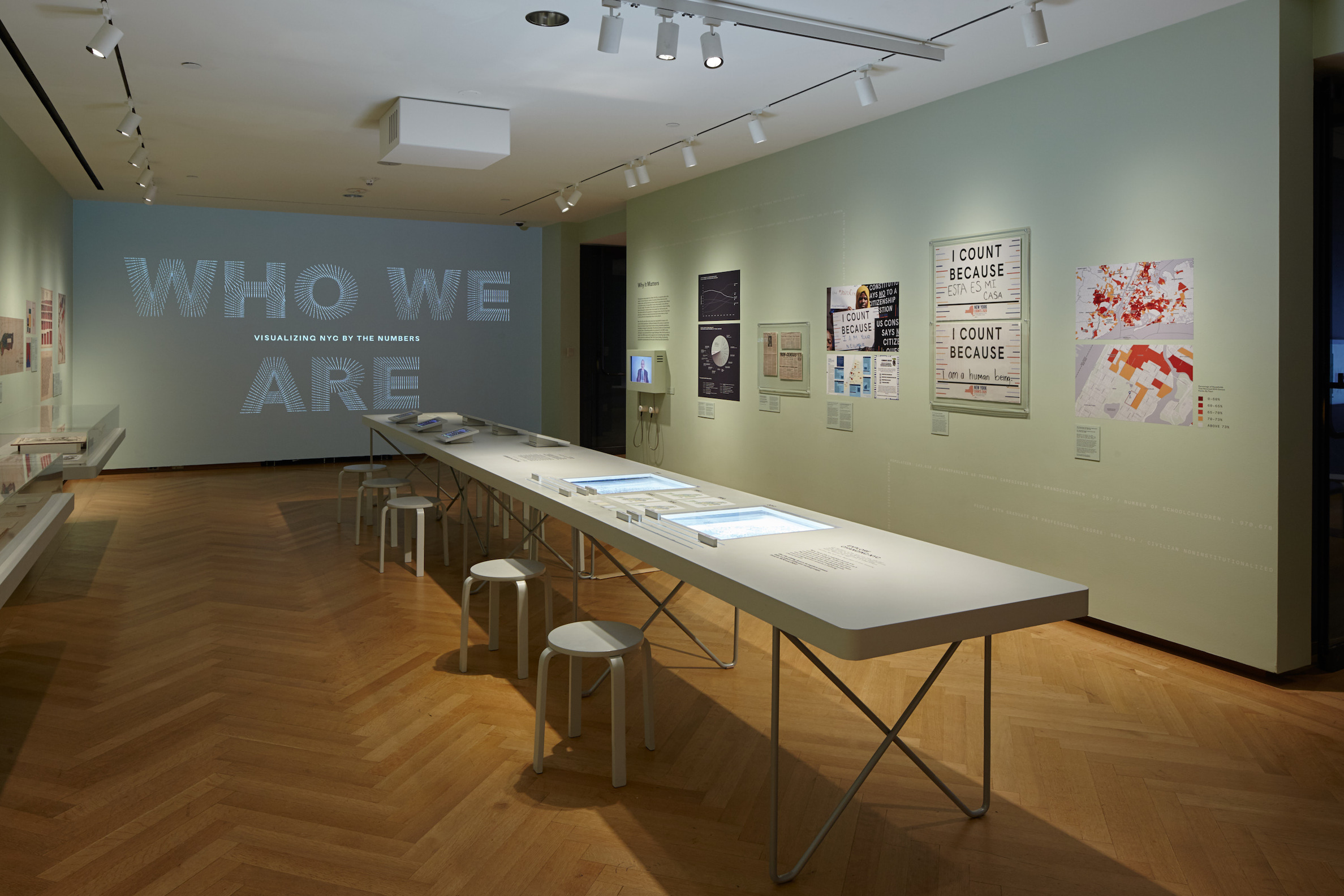
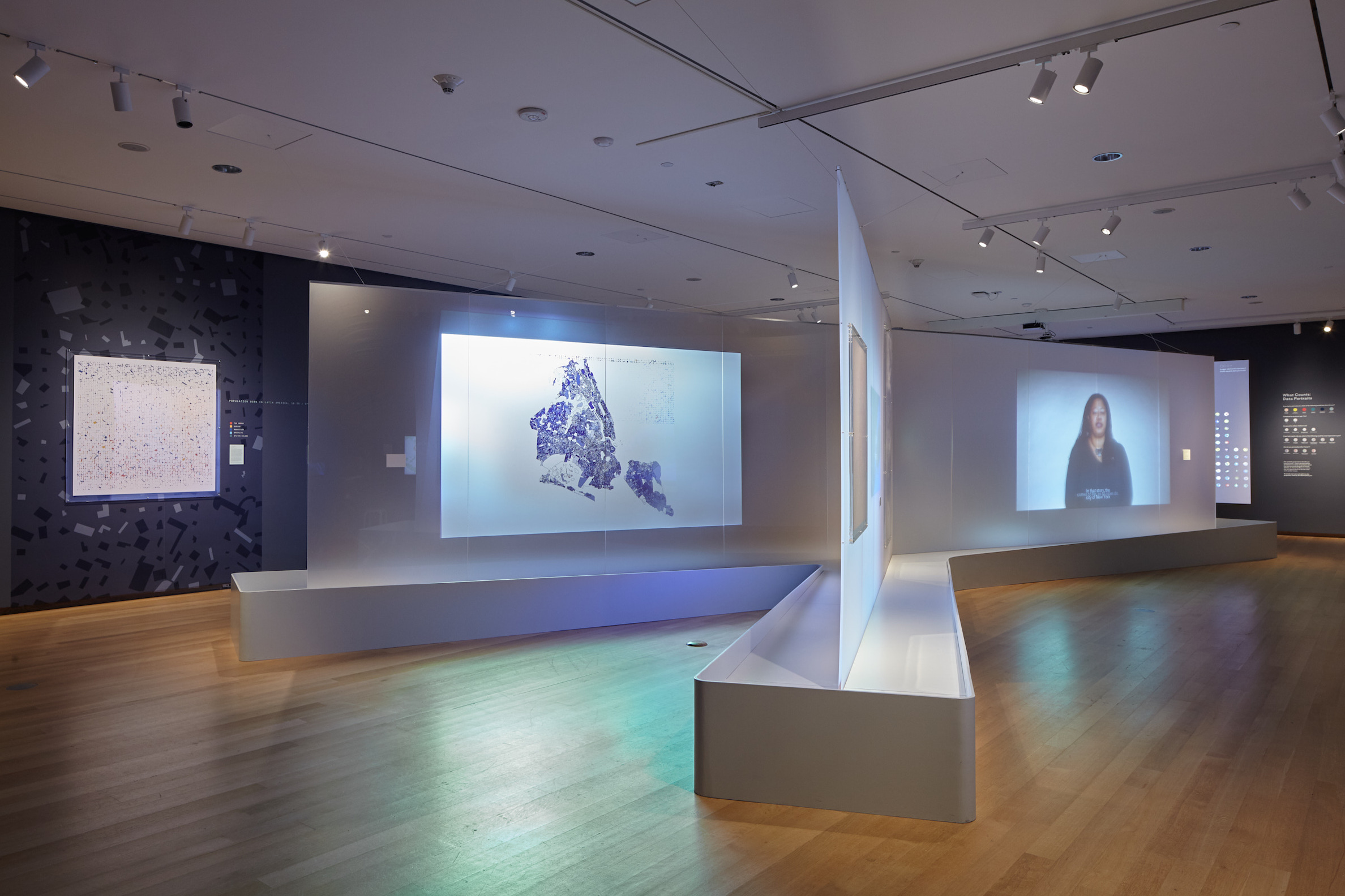
To mark Census Day on April 1, 2020, we consider the questions we ask of ourselves, how we represent ourselves to the world, the ways in which we are categorized, and what goes missing or unstated in the process. For more, check out our other two stories in this series: Why the Census Matters and The Art of Data, inspired by our current exhibition Who We Are: Visualizing NYC by the Numbers, guest curated by Kubi Ackerman.
The federal census is the primary source of population information for New York City and the nation at large. The United States was one of the first modern countries to constitutionally mandate an enumeration for the purposes of distributing tax revenue and apportioning political power. The first census was taken in 1790, just three years after the ratification of the US Constitution. Ever since, the census has shaped and reflected the complex and contentious process of defining identity in the United States.
The census itself has changed over time—the questions it asks, the form it takes, and the way its data is collected and compiled. Each of these factors has affected the information that is available and what the numbers tell us about who we are.
COLLECTING THE DATA
The census was originally conducted door-to-door, at first by US marshals and then, starting in 1880, by dedicated census officers. To staff the effort, the Census Bureau has historically hired hundreds of thousands of workers to walk the streets in every neighborhood, in what amounts to the nation’s largest recurring temporary employment program.
In 1960, the Bureau began the process of mailing the questionnaire for household members to fill out and return on their own. Even after the introduction of the mail-in census, trained workers still followed up by visiting residences that had not returned their forms. Shirley Chisholm, the first black woman elected to Congress, volunteered as an enumerator for the 1970 census to encourage her constituents to be counted.
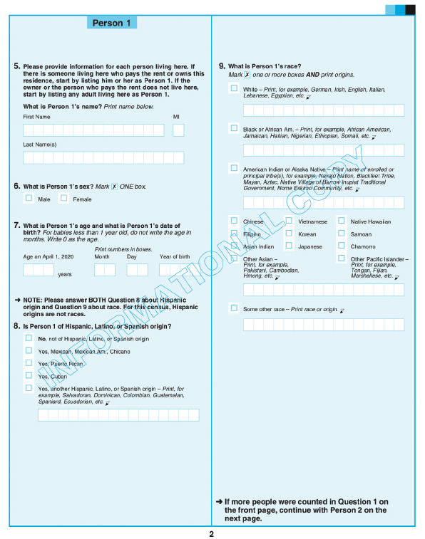
The 2020 census will be the first available to be filled out online, which will provide ease of use for many; but this innovation is also sparking concerns around digital security and participation among communities that may not have easy access to the internet or computers. Census enumerators will follow up door-to-door to count people who do not respond online.
WHAT THE CENSUS CALLS US
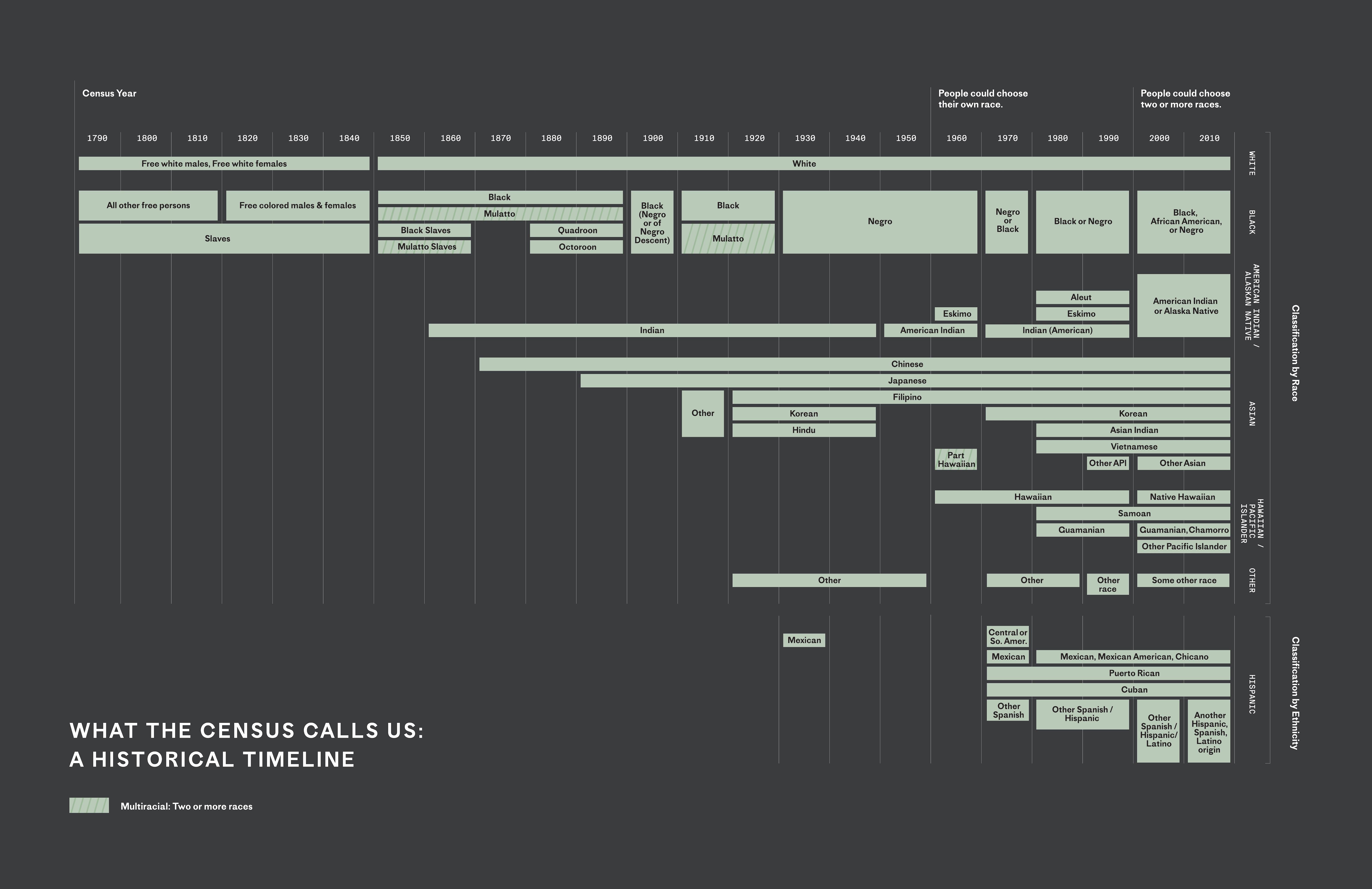
The classifications used by the census are determined by federal standards that both reflect and shape the nation’s contentious and evolving attitudes toward race. Entire groups, like Native Americans, have sometimes been omitted altogether, and some categories historically included on the form—such as “quadroon” or “octoroon”— have reflected and reinforced racist ideas prevalent throughout much of the nation’s history. In the first eight censuses, enslaved persons were enumerated as a separate category; they counted as three-fifths of a person for the purposes of congressional representation, increasing the political power of slaveholding states.
Over time, additional racial categories were added to the questionnaire. In 1970, the census began asking about Hispanic origin. As of the 2000 census, respondents could select two or more categories, a recognition of individuals of mixed race. But the issue of racial classification remains contested—for example, there is no category for people of Middle Eastern or North African descent, although people of all races and ethnicities are able to self-report their ancestry on the 2020 census. Activists have also argued for a reconsideration of other categories, including binary gender classifications.
MAKING DATA VISIBLE
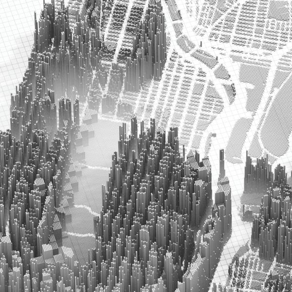
The raw information collected from the census does not “speak for itself.” The massive quantity of data needs to be analyzed and interpreted in order to answer questions about who we are. As long as data has been collected, researchers, urban planners, and others have found patterns and correlations, tested policy proposals, and promoted specific causes. The process of analyzing the volume of resulting information has led to innovations in the realms of data science and computing, as well as in the burgeoning fields of digital mapping and data visualization.
The decision about how to visualize information is a complex, creative, and inherently subjective one. Long before the advent of powerful digital tools for analyzing data, people found innovative ways of communicating numbers. The historic examples shown here demonstrate how data is used to construct knowledge, pursue political agendas, and incite curiosity, often in ways that are beautiful as well as informative.
![[The Georgia Negro] City and Rural Population. 1890.](/sites/default/files/DB1%20-%20City%20and%20Rural%20Populations%20Visualization%2C%20W.E.B.%20Du%20Bois_0.jpg)
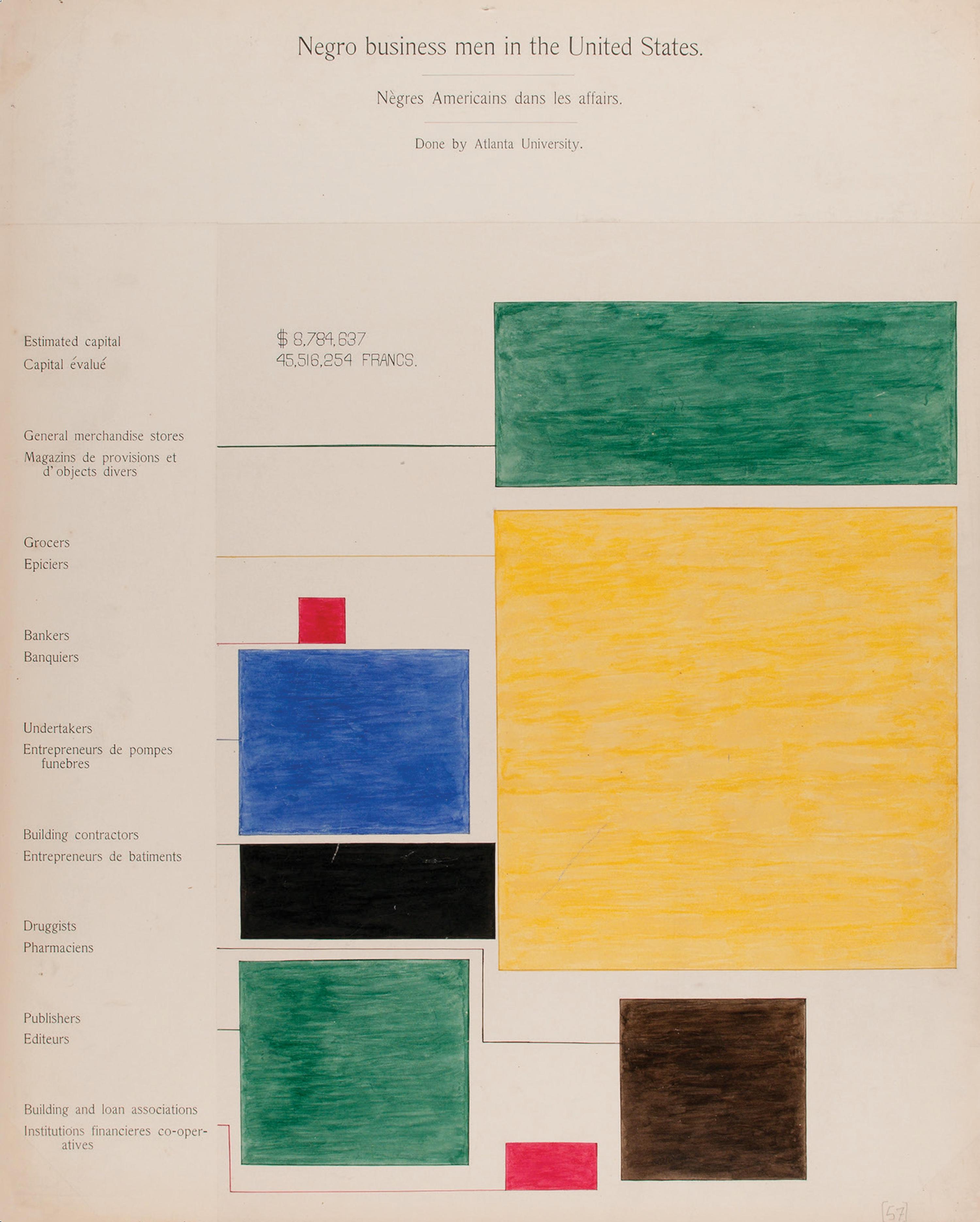
On the left, this “tree map,” rendered as a modernist abstraction in its color and composition, shows the most common businesses owned by black Americans in 1900. W.E.B. Du Bois used the term “negro,” which commonly referred to black Americans at the time. The chart shows that most businesses owned by black American were retail stores, but they also had significant presence in other industries such as publishing and undertaking.
On the right, this unusual bar chart shows that in 1890 a vast majority (86 percent) of black Americans in the United States lived in rural areas (represented by the red bar, coiled into a spiral to fit on the page), with smaller numbers living in small towns and cities (yellow, blue, and green bars). This was part of the legacy of slavery, abolished less than 30 years earlier, which was concentrated in agricultural areas. Today, the distribution of the black American population is reversed, with 86 percent living in urban or suburban areas.
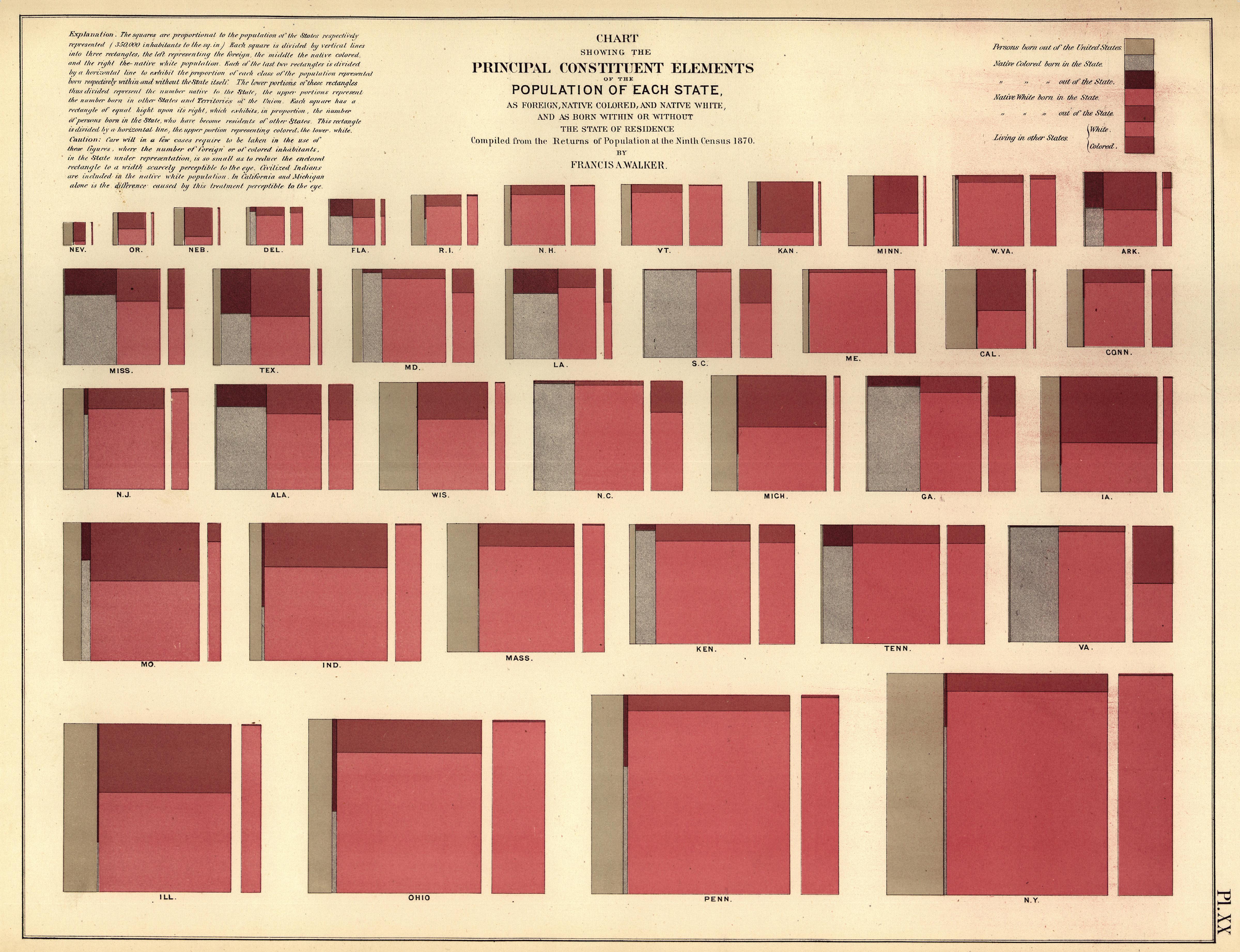
The chart captures an important historical moment. In 1870, New York was the most populous state (bottom right), but many Midwestern and Western states were growing fast. Many New Yorkers were leaving for other states, as shown by the rectangle on the bottom right, and New York’s population remained largely white, with the country’s “colored” population concentrated in the former slaveholding states of the South.
This visualization was created by Francis A. Walker, considered the dean of American economics. At age 29, he served as superintendent of the 1870 census and quickly became a pioneer in data visualization. The volume in which this visualization appeared is considered the first statistical atlas ever created.
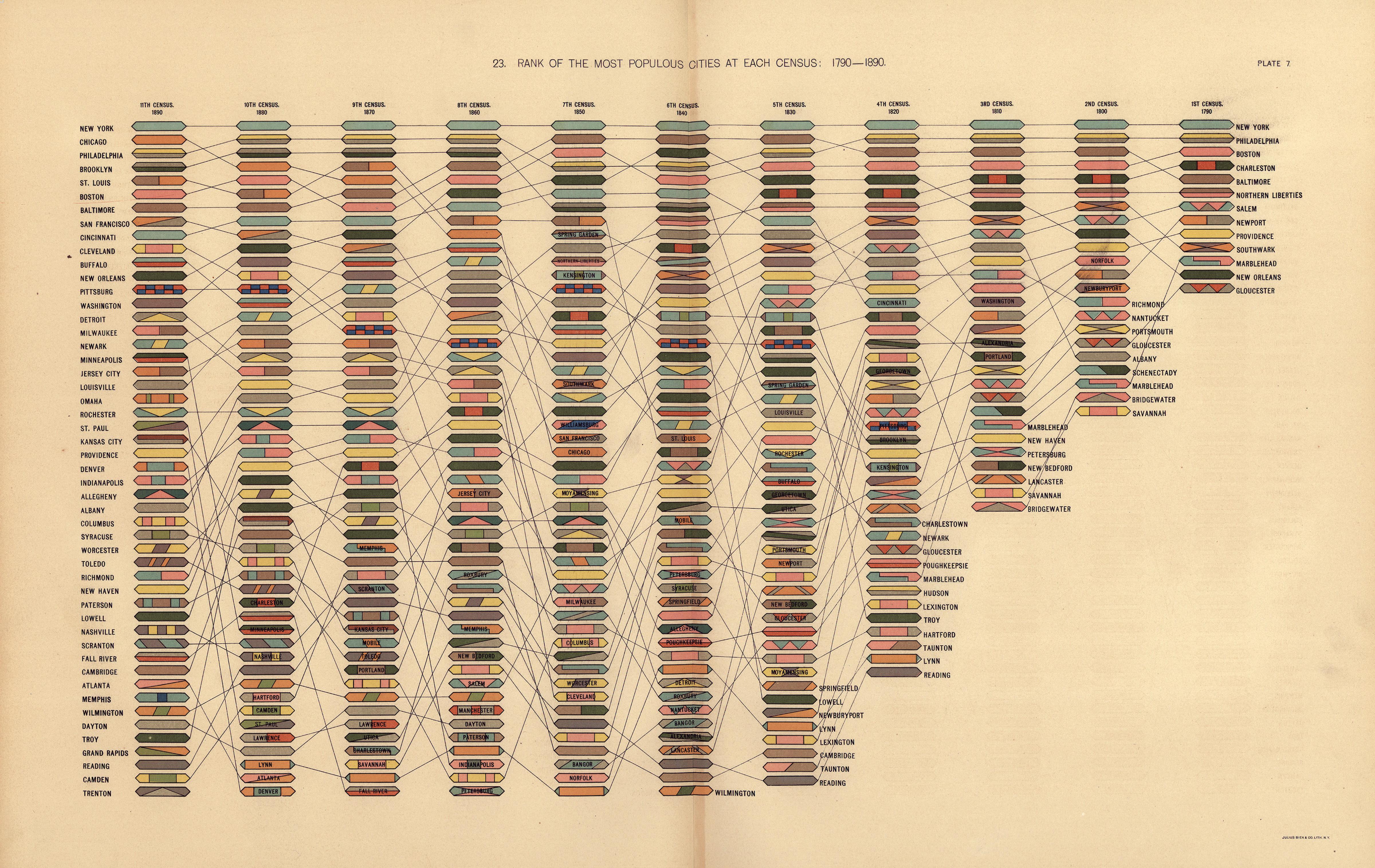
This chart shows the relative rank of US cities from 1790 to 1890. Reading from right (1790) to left (1890), each city is represented by its own color-coded icon. Its place in the ranking can be traced by following the lines that connect across columns.
The century covered by the chart was a period of rapid population growth and urbanization, as shown by the increasing number of cities in the left-hand columns. The chart also illustrates the southward and westward expansion of the nation—in 1790, all of the largest cities except for New Orleans were in the Northeastern United States (“Northern Liberties” and “Southwark” were later incorporated into Philadelphia); by 1890 about half of the 50 largest cities were in the Northeast. Today, only three of the nation’s 50 largest cities are in the Northeast.
Recent advances in digital mapping and data analysis software have made the tools for understanding and visualizing this information even more widely accessible. Our story The Art of Data showcases work by data analysts, demographers, and contemporary artists and designers who use these tools to enliven and humanize statistics and to shed new light on how we understand our urban environment and ourselves.
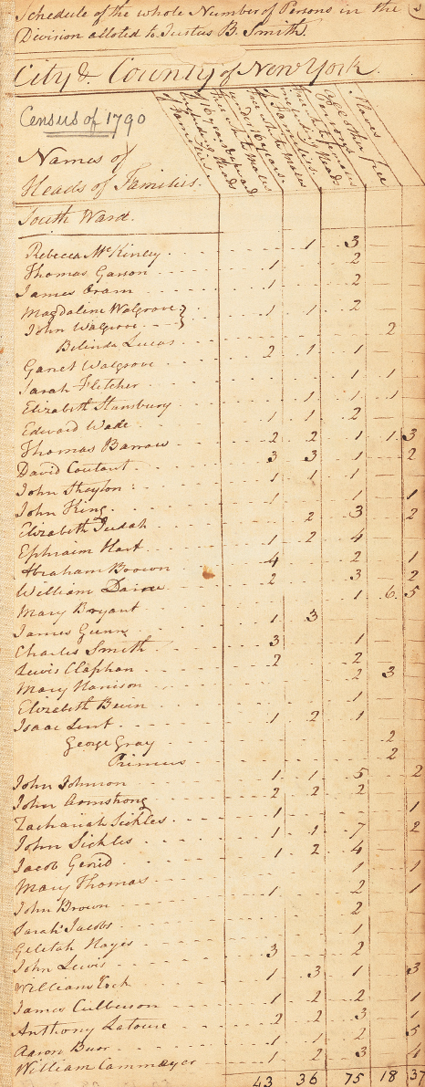
1. Page from the United States federal census for New York’s South Ward, 1790. Courtesy National Archives and Records Administration, Records of the Bureau of the Census, Record Group 29.
2. 2020 census form. Courtesy New York Regional Census Center, United States Census Bureau.
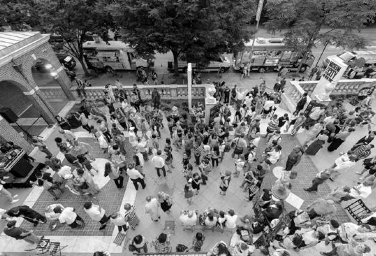
3. Photo: Brad Farwell/Museum of the City of New York.
Related Exhibition - November 22, 2019 - October 18, 2020
Who We Are
Related Stories
Why the Census Matters