The Art of Data
Tuesday, March 31, 2020 by
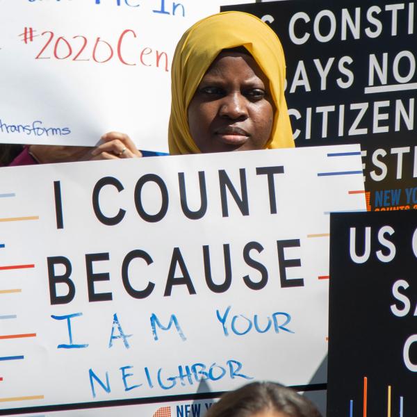
To mark the 2020 census, our current exhibition Who We Are: Visualizing NYC by the Numbers showcases work by artists and designers that demonstrate the power of numbers in helping us understand New York and New Yorkers.
Many of these works aim to uncover unusual or unexpected insights and to do so with explicitly political or activist intent. Some of the contributors focus on how race is defined and inscribed in the economic and political landscape, or the degree to which immigration has shaped the city, two issues that reflect the political discourse of our time. Others draw attention to the extremes of income inequality in New York, one of the wealthiest cities on earth. Many of the pieces interrogate the very process of collecting demographic information. Together, they encourage us to consider the questions we ask of ourselves, how we represent ourselves to the world, the ways in which we are categorized, and what goes missing or unstated in the process.
Take a look and check out our other two stories in this series: The Census: Collecting Information on Who We Are and Why the Census Matters.
SIMULATED DENDOCHRONOLOGY OF IMMIGRATION TO NEW YORK CITY, 1840–2017, 2019
Pedro Cruz, John Wihbey, and Felipe Shibuya
Courtesy Pedro Cruz, John Wihbey, and Felipe Shibuya
The growth of cities is shaped by a host of external factors, as they register information from the environment and encode it in their structures. New York City has been molded by decades of immigrant arrivals, their movements determined by global political and economic conditions. Here, an interdisciplinary team of faculty from Northeastern University has visualized the shifting origins of immigrants as growing tree rings.
The designers of this piece used each ring to represent one decade of immigrant arrivals to New York City from 1840 to 2017, with each cell representing 40 people. They color-coded the cells by geography and positioned them in the direction of the immigrants’ home countries. Rings that are more skewed toward the east, for example, show more immigration from Europe, while rings skewed south show more arrivals from Latin America. The earlier historical data remains present and visible even as immigration grows and changes over time, representing the core of the metaphoric tree.
Source: This work uses census microdata from the Integrated Public Use Micro Series (IPUMS). Rather than summary tables, it draws on millions of individual, anonymized questionnaires. Because the census records for 1890 were destroyed in a fire, estimates for that decade were derived from the mid-curve between 1880 and 1900.
GRID SERIES, 2019
Neil Freeman
Courtesy of the artist
The census divides New York City into geographic units—blocks and tracts—for statistical purposes. These units have a logic of their own, effectively creating a parallel universe, a model of the city that lives only in databases and bureaucratic forms. This model is tremendously useful, and in many ways, it corresponds to the real city, but artist and urban planner Neil Freeman urges that we should not forget that it is an intermediary construct. By disassembling the census map and reordering its units in a grid according to their relative values with regard to specific metrics, Freeman reveals patterns of inequity and injustice that play out across New York City.
Source: This work uses census block group data from the 2017 American Community Survey five-year estimates.
LANGUAGES OF NYC, 2019
Jill Hubley
Courtesy of the artist
New York City is one of the world’s most linguistically diverse cities, due to its longstanding attraction for immigrants from around the world. While in many neighborhoods English is the shared language on the street, census data reveals that only half of New Yorkers speak English at home. A quarter speak Spanish, and the rest speak one or more of hundreds of different languages.
The work shown here, by artist, designer, and developer Jill Hubley, maps this polyglot diversity. Her visualization showcases the power of census data to reveal more than what is visible in public and to uncover geographic settlement patterns throughout the city. But it also shows the limits and biases of the data— “African languages,” for example, are not differentiated from one another in the census.
This map, available online as a digital interactive, shows the most prevalent languages spoken in each census tract. Select “Exclude English” or “Exclude English and Spanish” in the top left-hand corner to reveal where speakers of languages other than these two dominant languages live. Select or deselect specific languages on the left-hand side to explore where different immigrant groups call home in New York City.
Source: This map uses “language spoken at home” data from the 2017 American Community Survey five-year estimates.
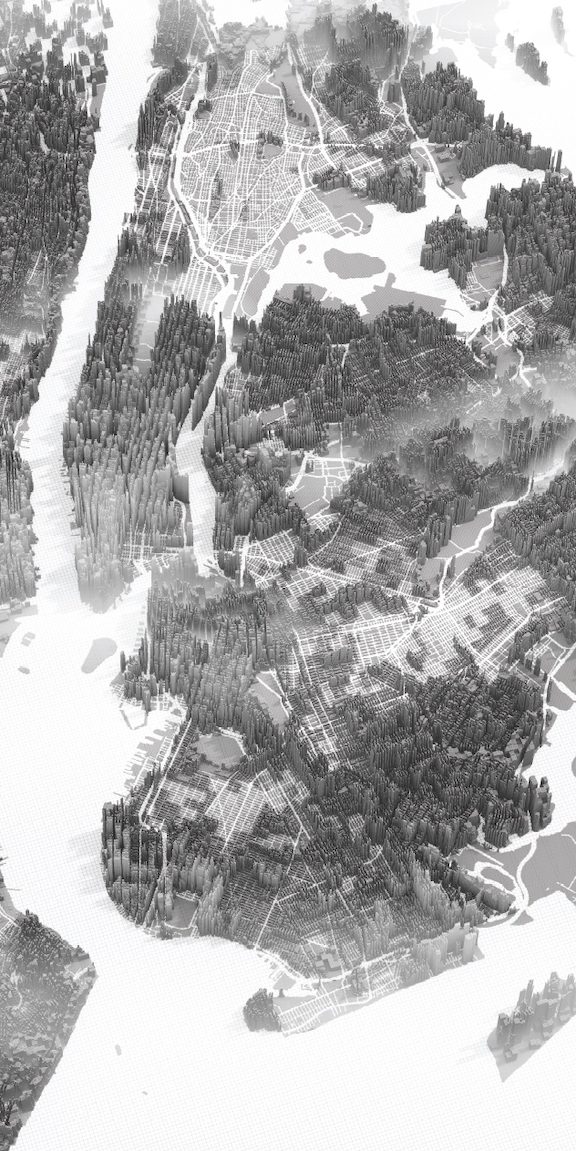
LANDSCAPES OF INEQUALITY: NEW YORK CITY NO. 2, 2019
Herwig Scherabon
Courtesy Herwig Scherabon
New York City is a place of economic extremes, home to some of the wealthiest and poorest neighborhoods in the nation. Here, artist Herwig Scherabon visualizes these differences as abstracted forms that uncannily mirror our usual reading of the urban landscape mapped onto the street grid. In Scherabon’s rendering, the geography of New York remains, but the city itself takes on new forms as income segregation boundaries appear as wall-like structures, a metaphor for how residents in the same city can live in very different worlds.
The height of the extruded cubes corresponds to median household income, with higher sections of the matrix representing higher incomes and lower areas representing lower incomes.
Source: This work relies on block-level median household income data from the 2017 American Community Survey five-year estimates.
SPECULATIVE FICTION AUTHOR N.K. JEMISIN ON DATA IN FICTION
In her short story “The City Born Great” (2016), science fiction and fantasy writer N. K. Jemisin tells a story about New York City that partly relies on the same kind of data used in the visual works in our exhibition. While her creative process as an author is different from that of the other visual artists showcased here, there is a common care and engagement with data, and a shared concern for what it tells us about who we are.
Jemisin’s process for developing her characters in “The City Born Great” was inductive. She used general, demographic data to invent an avatar to embody the characteristics of New York City. The city’s resulting avatar is a homeless, queer, black youth who faces a life-and-death struggle against an ancient and ever-changing enemy that aims to squash the city’s uniqueness and strangeness. In this excerpt, the avatar uses his/the city’s body to wage battle against the foe on an urban scale.
A three-time Hugo Award recipient, Jemisin has built on the premise of “The City Born Great” in a new trilogy. In its first volume, The City We Became, not just the city but each of its five boroughs are represented by avatars who embody the demographics and histories of the Bronx, Brooklyn, Manhattan, Queens, and Staten Island.

A COUNTING, 2019
Ekene Ijeoma with the Poetic Justice Group
Courtesy of the artist and MIT Media Lab
View A counting here.
New York City is known as the “immigrant city” of America. It is the most linguistically diverse city in the world, with over 800 languages spoken. However, many of these languages are endangered, as immigrant and first-generation speakers assimilate into English-speaking America. Here, artist Ekene Ijeoma, founder/director of Poetic Justice at the Massachusetts Institute of Technology (MIT) Media Lab, aims to bring our attention to issues of immigration, assimilation, cultural preservation, and representation.
In this work, living languages, as well as rare and endangered ones, are used to count to 100. Ijeoma explains that, “counting in multiple languages and dialects counters the census, which has historically miscounted and misrepresented non-white Americans/marginalized people.” For each number, a different voice and language sample is used. An algorithm selects which language samples are played based on the proportion of the New York City population that speaks each language, but inverted, so that the rarer and more endangered language samples are selected more.
Here is a list of languages included in this piece. You can add your voice and language by calling (917) 905–6647; new recordings will be added throughout the exhibition.
Source: This work uses “language spoken at home” data from the 2017 American Community Survey five-year estimates.
What unites all of these works is a desire to ask provocative questions about who we are as a society, as reflected in the data that is collected about us as individuals by the census and other sources, and to make the answers visible in a way that transcends mere reportage. By visualizing the information in novel ways, or making it otherwise sensory or experiential, these works show dimensions of urban life that usually go unnoticed.
Related Exhibition - November 22, 2019 - October 18, 2020
Who We Are
Related Stories
The Census and Who We Are